Small overview of HoloViz capability of data exploration#
This notebook is intended to present a small overview of HoloViz and the capability for data exploration, with interactive plots (show difference between matplotlib and bokeh). Many parts are based on or copied from the official HoloViz Tutorial (highly recommended for a more extensive overview of the possibilities of HoloViz).
Note: In June 2019 the project name changed from PyViz to HoloViz. The reason for this is explained in this blog post.
HoloViz Packages used for this notebook#
 |
 |
 |
 |
Exploring Pandas Dataframes#
If your data is in a Pandas dataframe, it’s natural to explore it using the .plot() method (based on Matplotlib). Let’s have a look at some automatic weather station data from Langenferner:
import pandas as pd
url = 'https://cluster.klima.uni-bremen.de/~oggm/tutorials/aws_data_Langenferner_UTC+2.csv'
df = pd.read_csv(url, index_col=0, parse_dates=True)
df.head()
| TEMP | RH | SWIN | SWOUT | LWIN | LWOUT | WINDSPEED | WINDDIR | PRESSURE | |
|---|---|---|---|---|---|---|---|---|---|
| 2013-07-13 00:00:00 | 1.634333 | 67.595753 | 0.0 | 0.0 | 212.744817 | 303.656833 | 4.436833 | 211.533333 | 692.622250 |
| 2013-07-13 01:00:00 | 1.388667 | 68.150512 | 0.0 | 0.0 | 209.781683 | 302.588717 | 5.544000 | 206.166667 | 692.395683 |
| 2013-07-13 02:00:00 | 1.064500 | 66.853977 | 0.0 | 0.0 | 207.234933 | 300.872133 | 5.573167 | 210.750000 | 692.200800 |
| 2013-07-13 03:00:00 | 0.985167 | 55.827547 | 0.0 | 0.0 | 207.913533 | 295.684267 | 3.970167 | 203.250000 | 692.163967 |
| 2013-07-13 04:00:00 | 1.155333 | 43.371014 | 0.0 | 0.0 | 211.513517 | 292.688400 | 3.267000 | 203.366667 | 692.001667 |
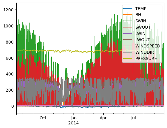
Just calling .plot() won’t give anything meaningful, because of the different magnitudes of the parameters:
df.plot();
Of course we can have a look at one variable only:
df.TEMP.plot();
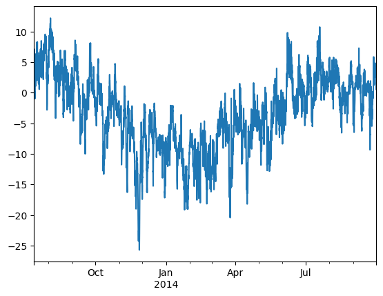
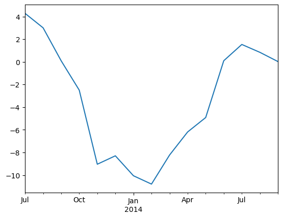
This creates a static plot using matplotlib. With this approach we also can make some further explorations, like calculating the monthly mean temperature:
dfm = df.resample('m').mean()
dfm.TEMP.plot();
/tmp/ipykernel_13737/2820268743.py:1: FutureWarning: 'm' is deprecated and will be removed in a future version, please use 'ME' instead.
dfm = df.resample('m').mean()
We can see the course of the parameter but we can not tell what was the exact temperature at January and we also cannot zoom in.
Exploring Data with hvPlot and Bokeh#
If we are using hvplot instead we can create interactive plots with the same plotting API:
you might need to install first hvplot via e.g. conda install -c pyviz hvplot
import hvplot.pandas
df.TEMP.hvplot()
Now you have an interactive plot using bokeh with zooming option and hover with additional information (get the exact values and timestamps), also possible for all variables but again not very meaningful:
plot = df.hvplot()
plot
But at least you can use your mouse to hover over each variable and explore their values. Furthermore, by clicking on the legend the colors can be switched on/off. Still, different magnitudes make it hard to see all parameters at once.
Here the interactive features are provided by the Bokeh JavaScript-based plotting library. But what’s actually returned by this call is a overlay of something called a HoloViews object, here specifically a HoloViews Curve. HoloViews objects display as a Bokeh plot, but they are actually much richer objects that make it easy to capture your understanding as you explore the data.
print(plot)
:NdOverlay [Variable]
:Curve [index] (value)
This object can be converted to a HoloMap object (using the HoloViews Package and declare bokeh to use for plotting) to create a widget that can be used to select the variables from.
import holoviews as hv
hv.extension('bokeh')


holo_plot = hv.HoloMap(plot)
print(holo_plot)
:HoloMap [Variable]
:Curve [index] (value)
holo_plot.opts(width=700, height=500)
But first have a look at the HoloViews Objects.
HoloViews Objects#
Creating a simple HoloViews Object:
import numpy as np
xs = np.arange(-10, 10.5, 0.5)
ys = 100 - xs**2
df_xy = pd.DataFrame(dict(x=xs, y=ys))
simple_curve = hv.Curve(df_xy, 'x', 'y')
print(simple_curve)
:Curve [x] (y)
:Curve [x] (y) is HoloViews’s shorthand for saying that the data in df_xy is a set of samples from a continuous function y of one independent variable x, and simple_curve simply pairs your dataframe df_xy with this semantic declaration.
Once we’ve captured this crucial bit of metadata, HoloViews now knows enough about this object to represent it graphically, as it will do by default in a Jupyter notebook:
simple_curve
This Bokeh plot is much more convenient to examine than a column of numbers, because it conveys the entire set of data in a compact, easily appreciated, interactively explorable format. HoloViews knew that a continuous curve like this is the right representation for what would otherwise be just a table of numbers, because we explicitly declared the element type as hv.Curve. Crucially, simple_curve itself is not a plot, it’s just a simple wrapper around your data that happens to have a convenient graphical representation. The full dataframe will always be available as simple_curve.data, for any numerical computations you would like to do:
simple_curve.data.tail()
| x | y | |
|---|---|---|
| 36 | 8.0 | 36.00 |
| 37 | 8.5 | 27.75 |
| 38 | 9.0 | 19.00 |
| 39 | 9.5 | 9.75 |
| 40 | 10.0 | 0.00 |
As you can see, with HoloViews you don’t have to select between plotting your data and working with it numerically. Any HoloViews object will let you do both conveniently; you can simply choose whatever representation is the most appropriate way to approach the task you are doing. This approach is very different from a traditional plotting program, where the objects you create (e.g. a Matplotlib figure or a native Bokeh plot) are a dead end from an analysis perspective, useful only for plotting.
HoloViews Elements#
Holoview objects merge the visualization with the data. For an Holoview object you have to classify what the data is showing. A Holoview object could be initialised in several ways:
hv.Element(data, kdims=None, vdims=None, **kwargs)
This standard signature consists of the same five types of information:
Element: any of the dozens of element types shown in the reference gallery.data: your data in one of a number of formats described below, such as tabular dataframes or multidimensional gridded Xarray or Numpy arrays.kdims: “key dimension(s)”, also called independent variables or index dimensions in other contexts—the values for which your data was measured.vdims: “value dimension(s)”, also called dependent variables or measurements—what was measured or recorded for each value of the key dimensions.kwargs: optional keyword arguments specific to thatElementtype (rarely needed).
Elements could be for example Curve, Scatter, Area and also different ways of declaring the key dimension(s) and value dimension(s) are shown below:
(hv.Curve(df_xy, kdims=('x','x_label'), vdims=('y','y_label')) +
hv.Scatter((xs,ys)).redim.label(x='x_label', y='ylabel') +
hv.Area({'x':xs,'y':ys}))
The example also shows two ways of labeling the variables, one is directly by the initialisation with tuples ('x','x_label') and ('y','y_label') and a other option is to use .redim.label().
The example above also shows the simple syntax to create a layout of different Holoview Objects by using +. With * you can simply overlay the objects in one plot:
from holoviews import opts
(hv.Curve(df_xy, 'x', 'y') *
hv.VLine(5).opts(color='black') *
hv.HLine(75).opts(color='red'))
With .opts() you can change some characteristics of the Holoview Objects and you can use the [tab] key completion to see, what options are available or you can use the hv.help() function to get more information about some Elements.
# hv.help(hv.Curve)
So now we can use some Holoview object for the data exploration for the glacier data. We create a Layout with some subplots for the different parameters. With opts.defaults() we can change some default properties of the different HoloView Elements, here we activate the hover tool for all Curve elements. Try to zoom into one plot!
opts.defaults(opts.Curve(tools=['hover']))
(hv.Curve(df, 'index', 'TEMP') +
hv.Curve(df,'index','RH') +
hv.Curve(df,'index','SWIN').opts(color='darkorange') * hv.Curve(df,'index','SWOUT').opts(color='red') +
hv.Curve(df,'index','LWIN').opts(color='darkorange') * hv.Curve(df,'index','LWOUT').opts(color='red') +
hv.Curve(df,'index','WINDSPEED') +
hv.Curve(df,'index','WINDDIR')).cols(3).opts(opts.Curve(width=300, height=200))
So here we created a Curve Element for some Parameters and put them together in subplots by using + and overlay some in one subplot with *. With .opts() I define the color of some parameters and set the width and height propertie for the used Curve Elements and with .cols() I define the number of columns.
Now we can zoom in and use a hover for data exploration and because all Holoview Objects using the same dataframe and the same key variable the x-axes of all plots are linked. So when you zoom in in one plot all the other plots are zoomed in as well.
HoloView Dataset and HoloMap Objects#
A HoloViews Dataset is similar to a HoloViews Element, without having any specific metadata that lets it visualize itself. A Dataset is useful for specifying a set of Dimensions that apply to the data, which will later be inherited by any visualizable elements that you create from the Dataset.
A HoloViews Dimension is the same concept as a dependent or independent variable in mathematics. In HoloViews such variables are called value dimensions and key dimensions (respectively). So lets take again our glacier pandas DataFrame and create a HoloView Dataset. Beforehand we define some new columns for the date. Then we create our HoloView DataFrame with the key variables (independent) month, year and day_hour. The remaining columns will automatically be inferred to be value (dependent) dimensions:
df['month'] = df.index.month
df['year'] = df.index.year
df['day_hour'] = df.index.day + df.index.hour/24
df['timestamp'] = df.index.strftime('%d.%m.%Y %H:%M')
df_month = hv.Dataset(df, ['month', 'year', 'day_hour'])
df_month = df_month.redim.label(day_hour='day of month')
df_month
:Dataset [month,year,day_hour] (TEMP,RH,SWIN,SWOUT,LWIN,LWOUT,WINDSPEED,WINDDIR,PRESSURE,timestamp)
Out of this Dataset we now can create a Holomap with .to. The .to method of a Dataset takes up to four main arguments:
The element you want to convert to
The key dimensions (i.e., independent variables) to display
The dependent variables to display, if any
The dimensions to group by, if nothing given the remaining key variables are used
slider = df_month.to(hv.Curve, ['day_hour'], ['TEMP', 'RH', 'SWIN', 'timestamp'])
slider = slider.opts(width=600, height=400, tools=['hover'])
print(slider)
:HoloMap [month,year]
:Curve [day_hour] (TEMP,RH,SWIN,timestamp)
We now created a HoloMap with to grouped variables [month, year], one key variable [day_hour] and five dependent variables (TEMP, RH, SWIN, WINDSPEED, timestamp). Now look at the visualisation (some months/year pairs are missing and cannot be visualized):
slider
We see that a widget was created where we can choose the 'month' and the 'year' (the two grouped variables). The plot is showing the 'day_hour' (key) variable against the first dependent variable 'TEMP'. The other dependent variables are not shown but their values are displayed in the hover.
For a better comparison we also can look at grouped variables at once when we use .overlay():
overlay = df_month.to(hv.Curve, ['day_hour'], ['TEMP', 'RH', 'SWIN','WINDSPEED','timestamp']).overlay()
overlay = overlay.opts(width=800, height=500, tools=['hover'])
overlay.opts(opts.NdOverlay(legend_muted=True, legend_position='left'))
print(overlay)
:NdOverlay [month,year]
:Curve [day_hour] (TEMP,RH,SWIN,WINDSPEED,timestamp)
Here we are creating an NdOverlay Object which is similar to a HoloMap, but has a different visualisation:
overlay
Here now no widget is created, instead there is a interactive legend where we can turn the color on by clicking in the legend on it. So we can compare the months with each other (for example the same month in different years).
It is also easy to look at some mean values, for example looking at mean diurnal values for each month and year you can use .aggregate, which combine the values after the given function:
df['hour'] = df.index.hour
df_mean = hv.Dataset(df, ['month', 'year', 'hour']).aggregate(function=np.mean)
df_mean = df_mean.redim.label(hour='hour of the day')
print(df_mean)
:Dataset [month,year,hour] (TEMP,RH,SWIN,SWOUT,LWIN,LWOUT,WINDSPEED,WINDDIR,PRESSURE,day_hour)
.aggregate() uses the key variables and looks where all of them are the same. It uses the provided function (in the case above np.mean) to calculate new values. So in the above case we calculate mean daily cycles for each month and year. The calculated Dataset then can be displayed as we have seen it above.
slider = df_mean.to(hv.Curve, ['hour'], ['TEMP', 'RH', 'SWIN']).opts(width=600, height=400, tools=['hover'])
print(slider)
slider
:HoloMap [month,year]
:Curve [hour] (TEMP,RH,SWIN)
overlay = df_mean.to(hv.Curve, ['hour'], ['TEMP', 'RH', 'SWIN']).opts(width=600, height=400, tools=['hover']).overlay()
overlay.opts( opts.NdOverlay(legend_muted=True, legend_position='left'))
print(overlay)
overlay
:NdOverlay [month,year]
:Curve [hour] (TEMP,RH,SWIN)
Using GeoView for displaying geographical data#
As a small example for using geoview I want to show how to display a shapefiles of glaciers in an interactive plot.
import geoviews as gv
import geopandas as gpd
/usr/local/pyenv/versions/3.11.9/lib/python3.11/site-packages/dask/dataframe/__init__.py:31: FutureWarning:
Dask dataframe query planning is disabled because dask-expr is not installed.
You can install it with `pip install dask[dataframe]` or `conda install dask`.
This will raise in a future version.
warnings.warn(msg, FutureWarning)
you might have to install geoviews for that!
Tile sources#
Tile sources are very convenient ways to provide geographic context for a plot and they will be familiar from the popular mapping services like Google Maps and Openstreetmap. The WMTS element provides an easy way to include such a tile source in your visualization simply by passing it a valid URL template. GeoViews provides a number of useful tile sources in the gv.tile_sources module:
import geoviews.tile_sources as gts
layout = gv.Layout([ts.relabel(name) for name, ts in gts.tile_sources.items()])
layout.opts('WMTS', xaxis=None, yaxis=None, width=225, height=225).cols(4)
To read the shape file geopandas could be used:
from oggm import utils
europe_glacier = gpd.read_file(utils.get_rgi_region_file('11', version='61'))
hintereisferner = europe_glacier[europe_glacier.Name == 'Hintereisferner'].geometry.iloc[0]
Then create a GeoViews Object with a GeoViews Element Shape, display it and put a gv.tile_sources in the background.
# hv.help(gv.Shape)
(gv.Shape(hintereisferner).opts(fill_color=None) *
gts.tile_sources['EsriImagery']).opts(width=800, height=500)
The GeoViews Object and Element is similar to HoloViews Objects and Elements for geographical data.
print(gv.Shape(hintereisferner))
:Shape [Longitude,Latitude]
And so similar a visualisation is stored for each GeoView Element, which can be used like an HoloView Object. So as a last example you also can plot all European glaciers in one interactive plot by using an Polygons Element of GeoViews:
(gv.Polygons(europe_glacier.geometry) *
gts.tile_sources['StamenTerrain']).opts(width=800, height=500)
---------------------------------------------------------------------------
KeyError Traceback (most recent call last)
Cell In[33], line 2
1 (gv.Polygons(europe_glacier.geometry) *
----> 2 gts.tile_sources['StamenTerrain']).opts(width=800, height=500)
KeyError: 'StamenTerrain'
So this only was a very small look at the capability of HoloViz for data exploration and visualisation. There are much more you can do with HoloViz, but I think it is a package you should have a look at, because with only a few lines of code you can create an interactive plot which allow you to have an quick but also deep look at your data. I really recommend to visit the official HoloViz Tutorial and start using HoloViz :)
What’s next?#
return to the OGGM documentation
back to the table of contents