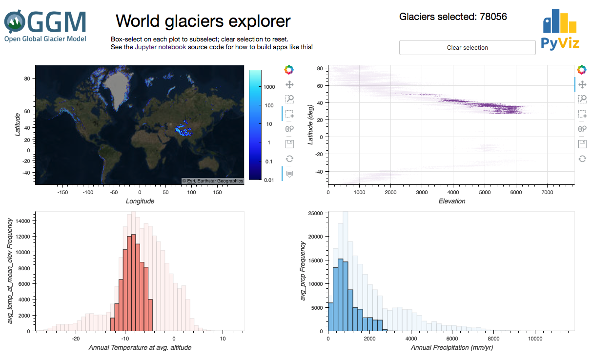
As you may know, we recently developed an interactive visualization during a hackathon in June.
The app was based on Dash by Plotly and at that time I was astonished how quickly I was able to create an interactive app from scratch, without any knowledge of either Plotly or Dash.
More recently, I got curious about impressive new tools developed by the PyViz team, and I started a Twitter discussion which ended much further than I would have expected!
The application
The PyViz members Philipp Rudiger and James Bednar took the challenge and made a new PyViz app to replace the Dash one in no time.
The app can be launched directly on MyBinder by clicking on the following link:
![]()
The code is hosted on github.
About the app
Visit this dedicated page to learn how to use the app and links to the data sources.
Datashader
For reference, here is the
equivalent application I wrote in Dash back in June. I won’t start a
debate about the difference between Dash and PyViz here (for a summmary, refer to
the official Panel FAQ). Furthermore, the
two apps are not equivalent, and my Dash and
CSS knowledge are too poor to make a fair comparison out of it.
However, the biggest difference between the old app and the new PyViz one is that the old one uses a reduced version of the data. Indeed, to make the app run smoothly, we had to bin the data into longitude/latitude ranges to reduce the total number of points to visualize. The PyViz app can rely on DataShader to reduce the data on the go, i.e. display the 200’000+ glacier points interactively without any latency. This is simply awesome, and opens many new opportunities for global visualizations based on OGGM.