This week I had to prepare a 30 min presentation for an audience of scientists with no glaciological background. I wanted to explain some basic concepts of glaciology, such as accumulation, ablation, equilibrium line altitude and mass movements in a glacier.
Since I’m no good at drawing and I thought these kind of graphics might be useful on other occasions, I asked a professional graphic designer (who also happens to be my sister) to make a series of simple glacier graphics that I could click through while explaining the major concepts.
Here is the result (click on the images for a larger version):
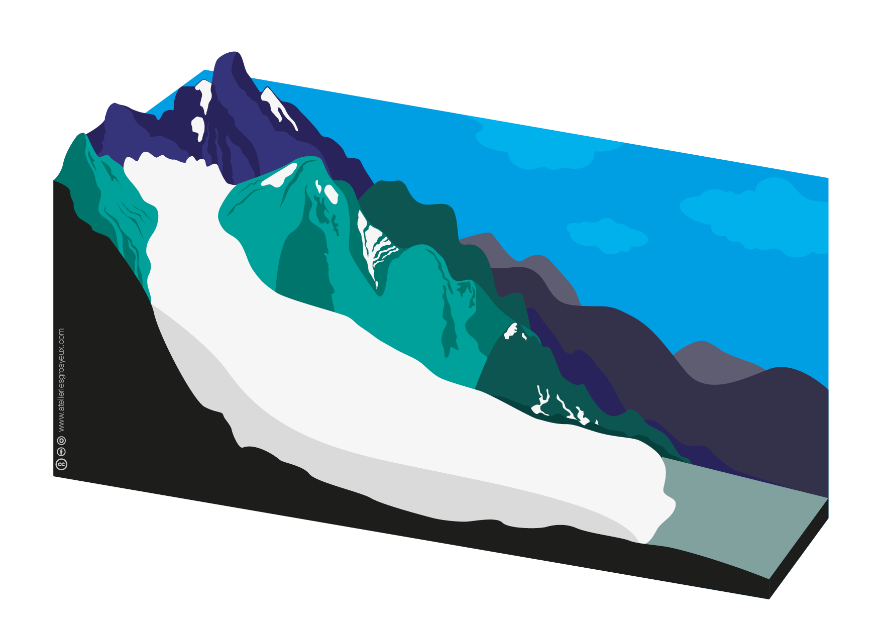
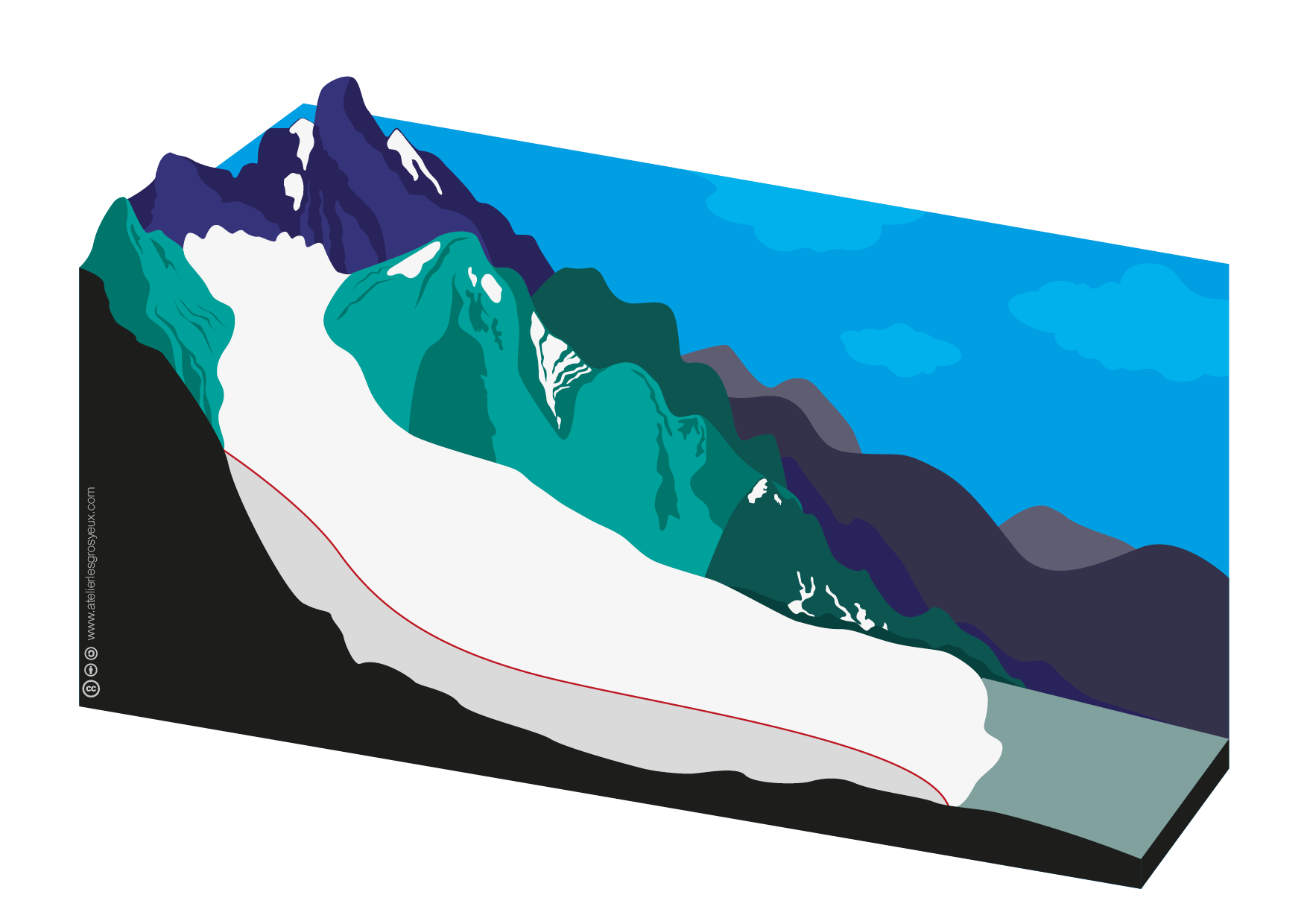
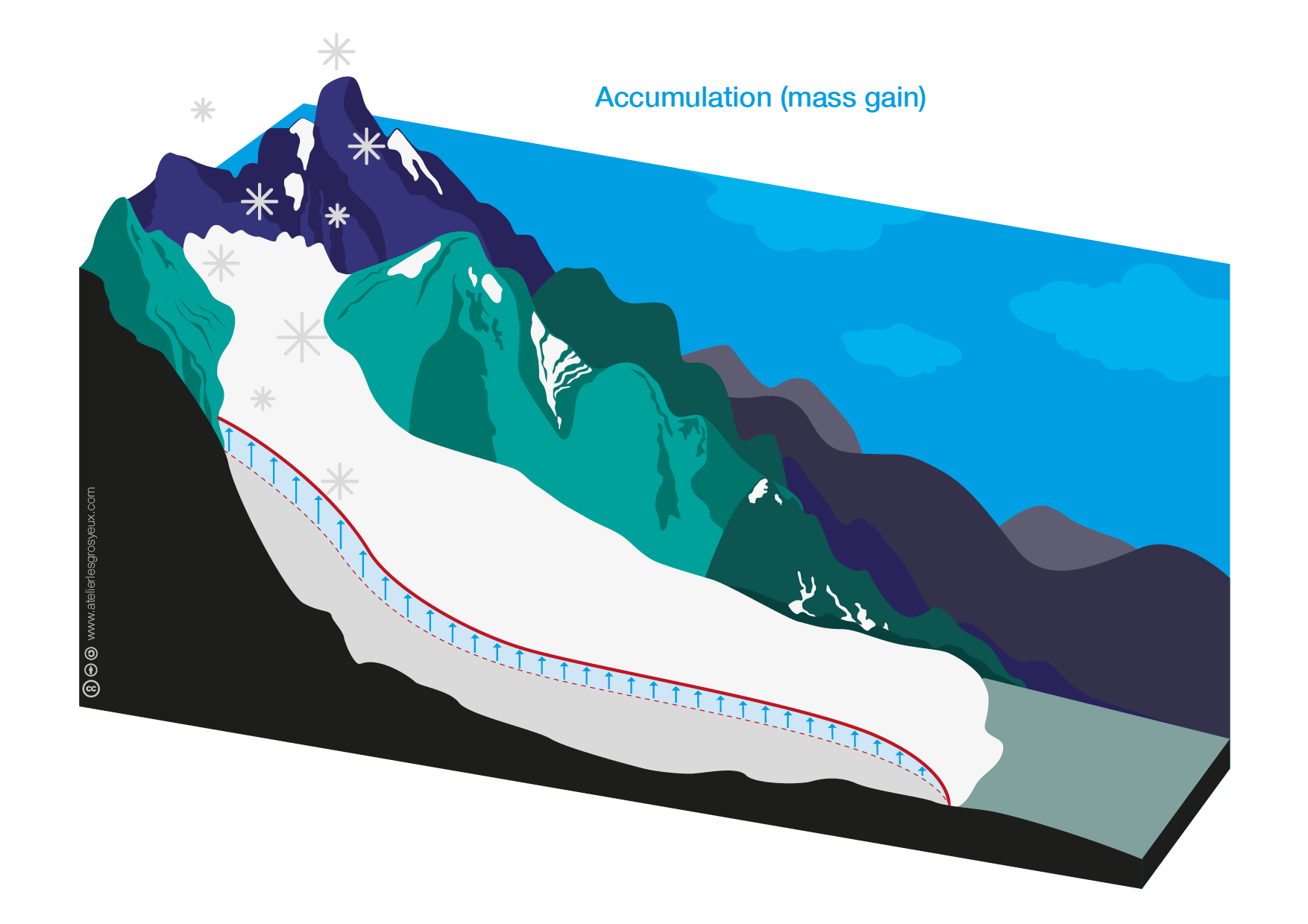
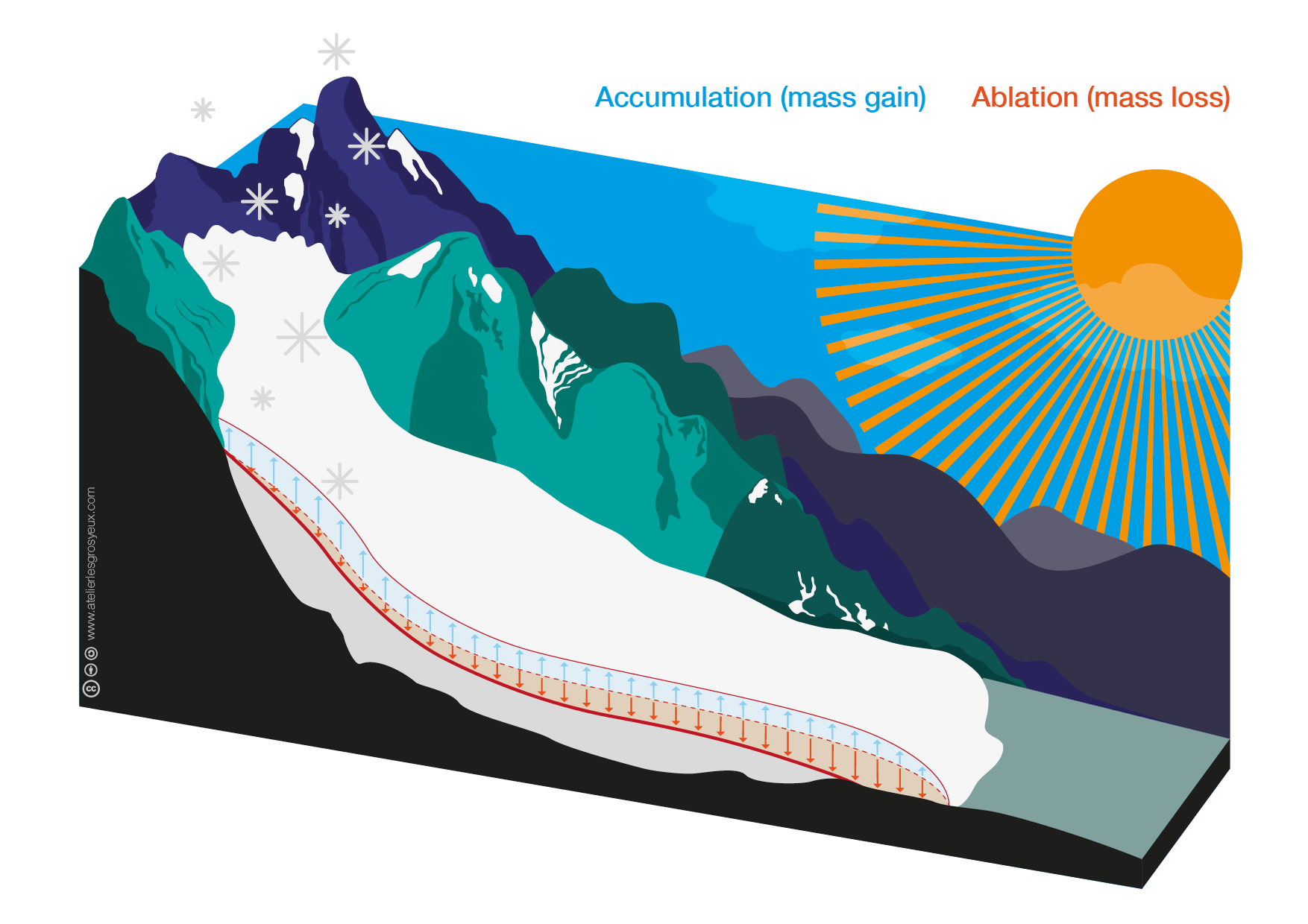
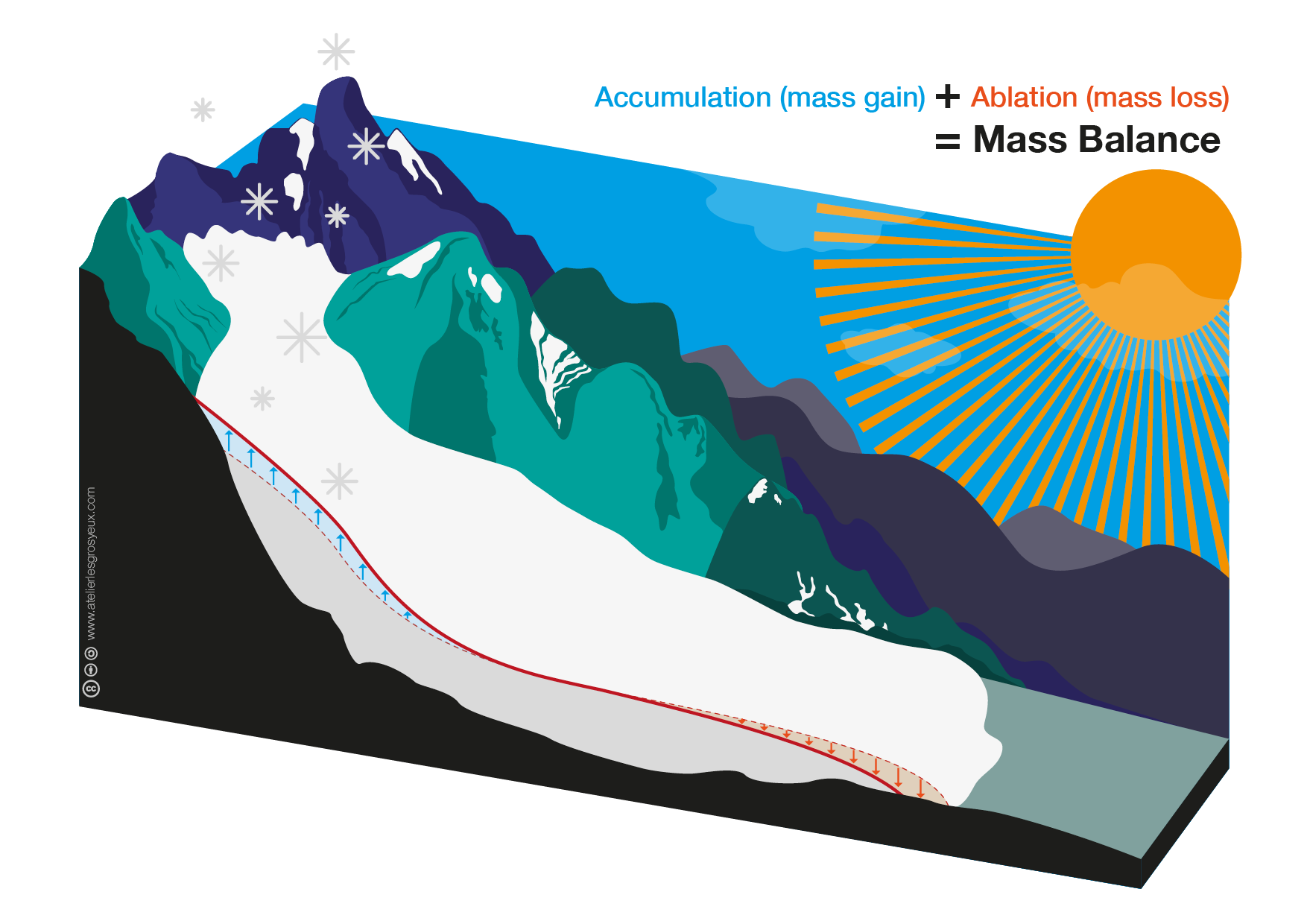
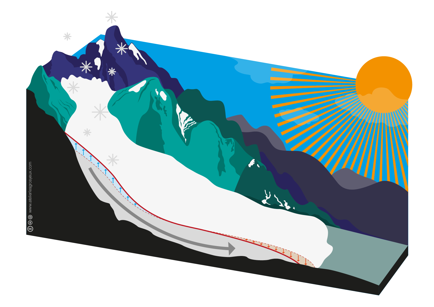
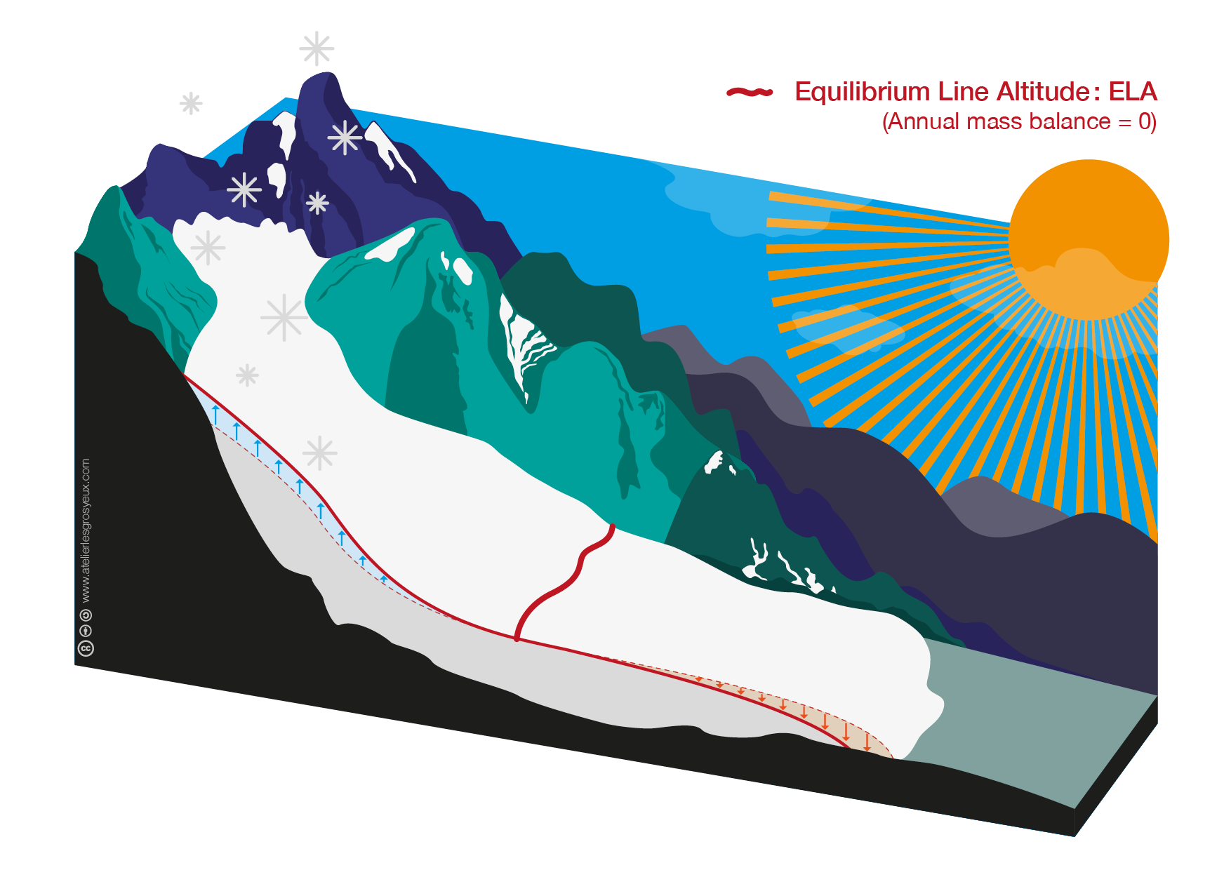
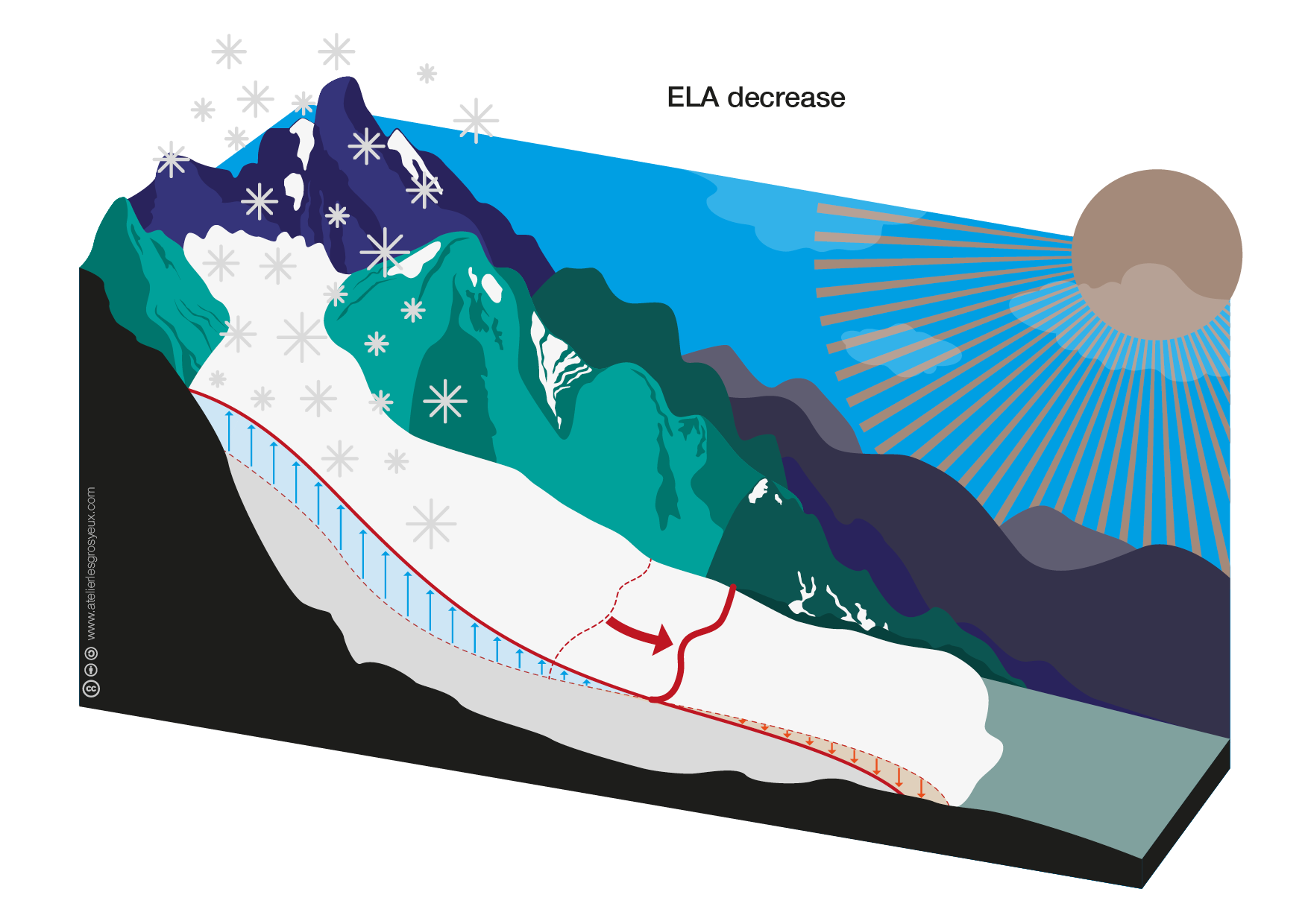
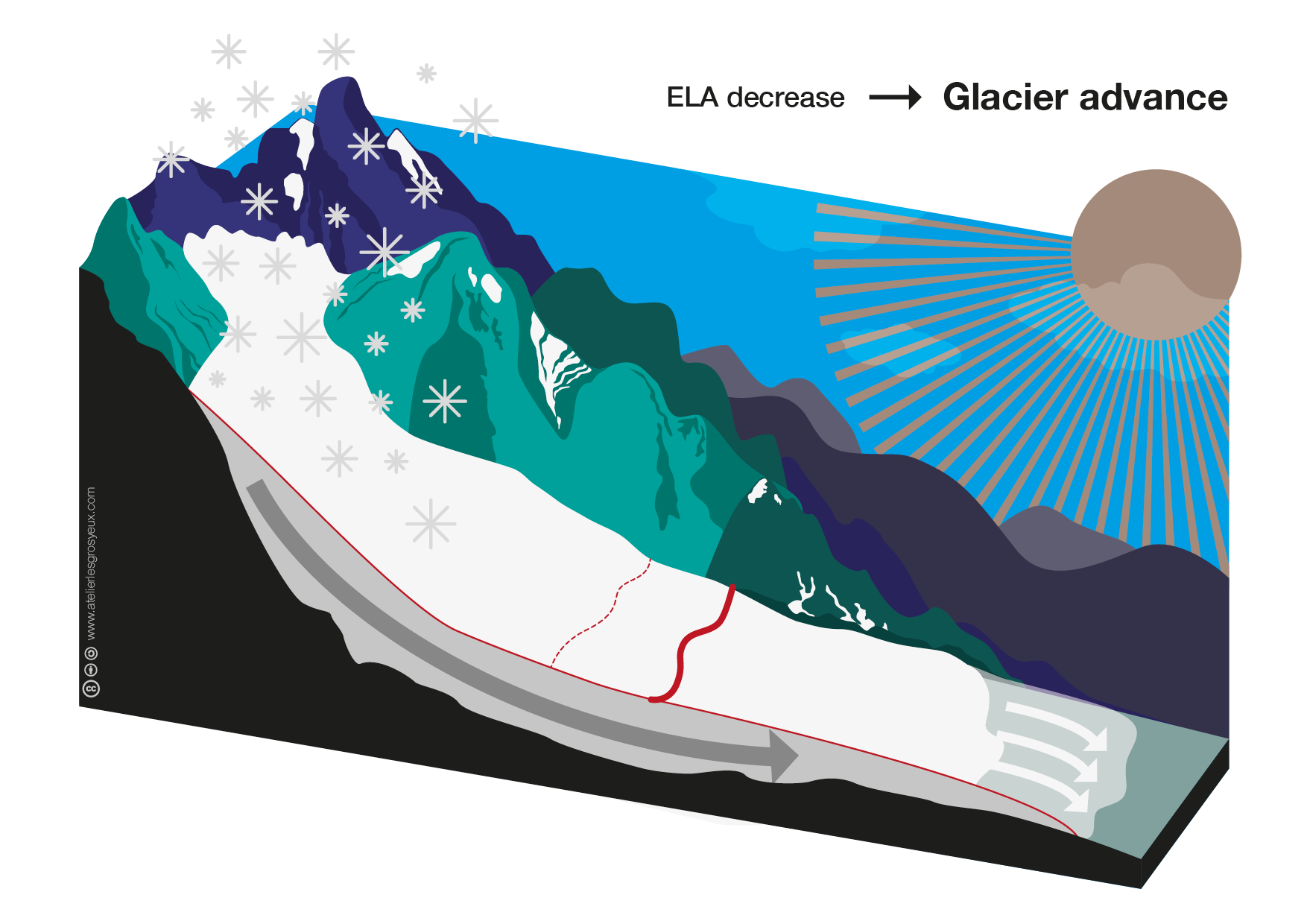
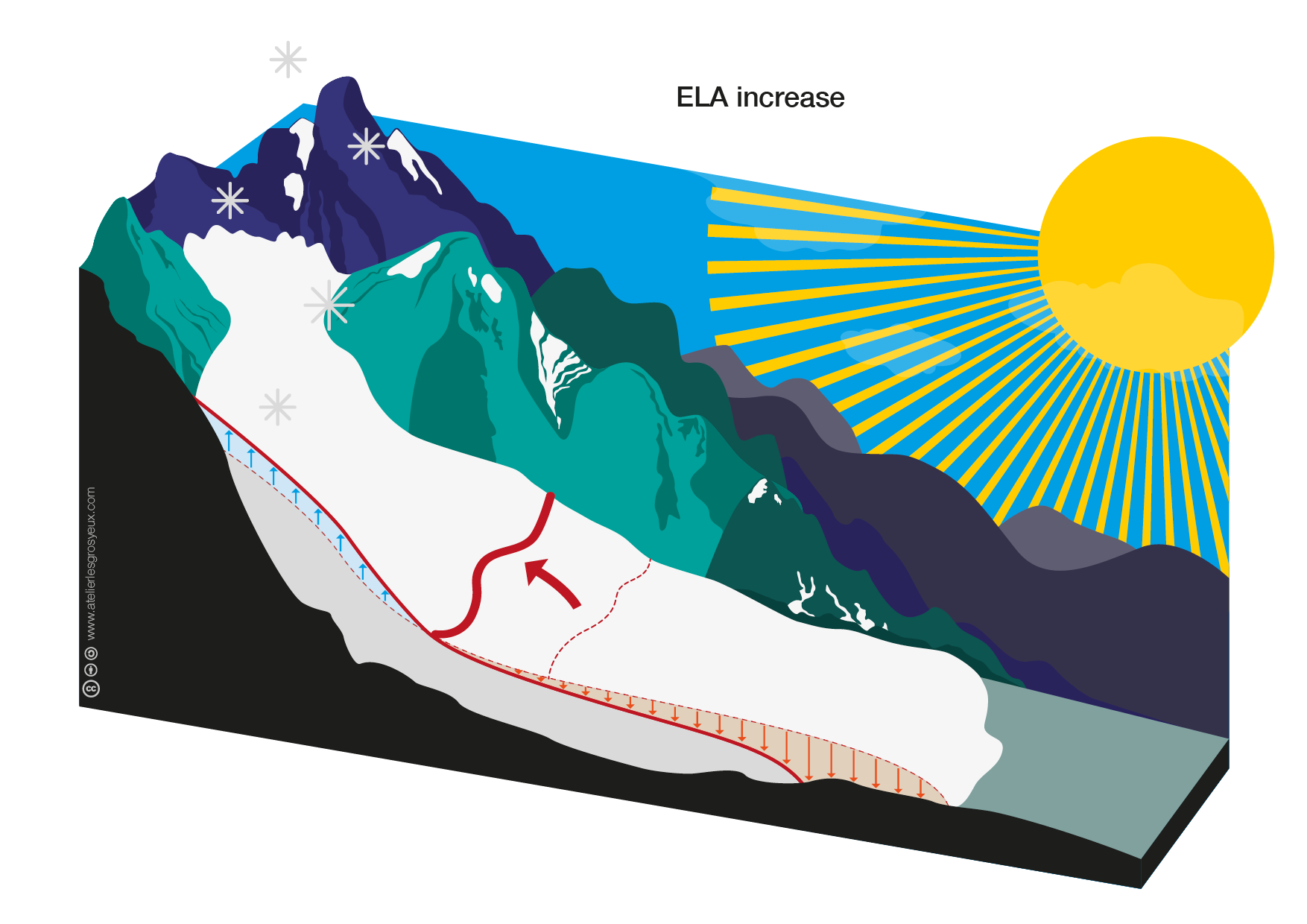
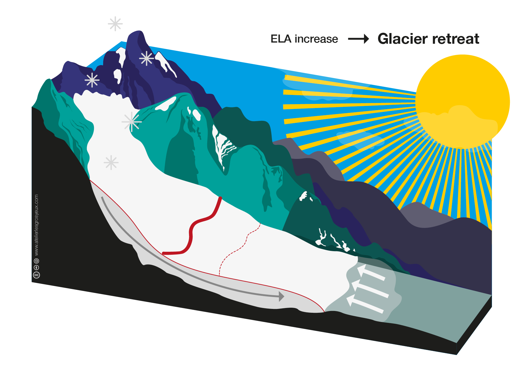
Although these are the first scientific graphics my sister ever made, I believe she made a really good job!
Since these images might be useful to others, we decided to release them under an open license. You’ll find all these graphics (as well as some other charts) on a dedicated repository.
Don’t hesitate to leave us some comments here or on Github! We’d love to hear your feedback as well as improvement suggestions.