OGGM participated to a hackathon event organized by the ECMWF in Reading. The hackathon tool place in the context of the #OpenDataHack2018 week, and the rules were quite simple: chose a programming challenge realizable in one day, form a team and hack during 24 hours under the motto “Innovate with Open Climate Data”.
I was there and came with a challenge idea: Open climate data seen by mountain glaciers as a natural low-pass filter. I was lucky to be joined by a new friend Patrick from the UK Met Office, who was of great help (both programmatically and psychologically ;).
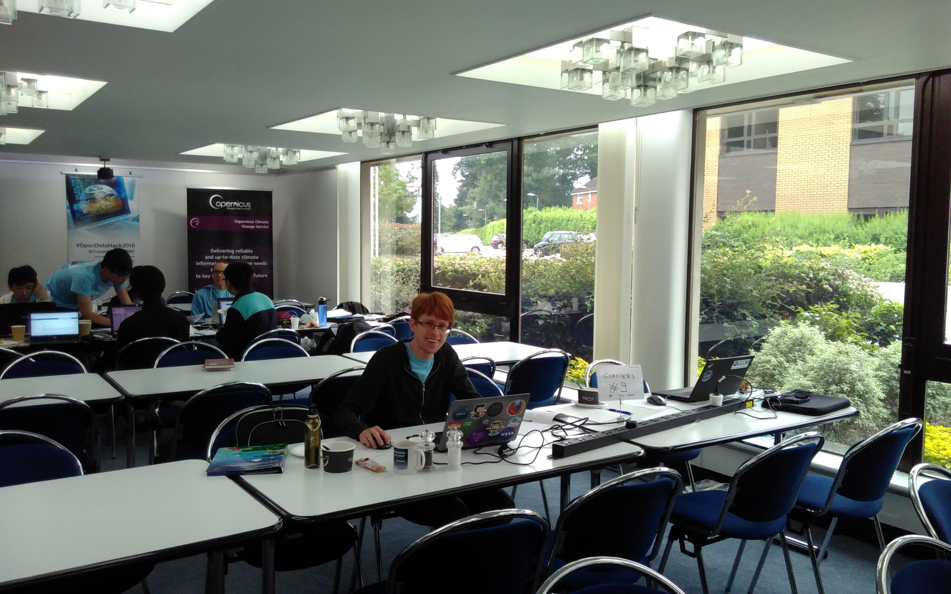 Patrick a work during the hackathon. Click
here for many more photos
form the organizers.
Patrick a work during the hackathon. Click
here for many more photos
form the organizers.
The outcome
After 24 hours of programming and little sleep, we came up with three online visualizations (I learned they’re called “dashboards”) which you can try out here: https://dash.klima.uni-bremen.de/.
They are written using OGGM and dash+plotly. I highly recommend both tools, they are great! It turns out the jury liked our apps too! We’ve been rewarded with a price in the category HackVis (visualizations).
The judges used 5 criteria to score the team projects: Originality and creativity, Technical innovation, Use of data and services, Impact and usefulness, Impressiveness (“Wow” factor). I am very proud we were selected, but I must say that many other projects deserved it as much as we did.
Here are the champions of the #opendataHack2018, the data lions of the week-end !
— Jean-Sebastien (@JeanSeb_Cases) June 10, 2018
Thanks to all teams for their ideas, work and commitment to achieve this effective work... #climatechange mitigation needs people like you @ECMWF @MFI_met @LeoDiCaprio @CopernicusECMWF @meteofrance pic.twitter.com/ilpc6WjsnP
The white boxes in our hands are “Virtual Reality Headsets”, which is something I didn’t know I needed but I now have one.
What did we do exactly?
Here are some info about the small apps we programmed. Code and data at the time of writing are available on this repository. For the runs I used a slightly modified version of OGGM available on this branch.
App 1: World glacier explorer
World #Glacier Explorer developed by @OGGM_org using ERA-Interim data #OpenDataHack2018 pic.twitter.com/BU4xdFB48P
— Mark Parrington (@m_parrington) June 10, 2018
In the first app, we used data compiled from our GMD paper about glacier locations, altitude and their climate. The application allows to select ranges of data in each single plot, actualizing the other plots instantly. It permits to gain more insight about the data and ask questions like: where are the warmest glaciers located? The wettest? What is the relationship between latitude and climate? etc.
In order to make the app more responsive I had to aggregate the data into 1° bins before display, which limits the number of analyses one can do. Some of the things I’d really like to see implemented soon:
- use bins of 0.3° instead (or even less?)
- rely on the higher resolution ERA5 data for climate information
- add Antarctic glaciers
- add other climate variables (seasonality, humidity, radiation?)
- add other glacier statistic (land/water terminating, glacier/ice caps, etc)
App 2: Climate change scenarios
In the second app (written by Patrick), we propose to explore the impact of various warming scenarios on all alpine glaciers larger than 5 km2. Users can select amongst 7 variables (length, area, volume, temperature, precipitation, solid precipitation, equilibrium line altitude) and plot them under a number of scenarios. When hovering with the mouse over a glacier, the plots should appear.
The data is generated artificially: we shuffled years from the last 31 years randomly and added a temperature bias (the “0.8°C warming” scenario is without any temperature bias, i.e. the untouched climate of 1985-2015).
I really like this app because people can choose their “favorite glacier” and see what is projected to happen. It clearly links climate to length and area changes, illustrating the “low-pass filter” role of glaciers. My original plan was to use real CMIP data for this app, but these data are nor yet available from the climate data store.
Some of the things I’d really like to see implemented soon:
- use real GCM data instead of the fake one
- one app per RGI region?
- more ways to select glaciers
- possibility to visualize both climate and glacier changes in the same view
App 3: Geometry changes
In the third app, a time slider allows to directly see the length and thickness changes of glaciers in the Öztaler Alps. The data is taken from the OGGM documentation script run for a “commitment experiment” (what happens if the climate doesn’t change anymore) and for a period of 100 years.
This app definitely needs more tuning (and wasn’t even shown during the hackathon presentation):
- it should be smoother and faster (I don’t know yet how to do this)
- we need a way to represent the glacier widths, too
- different scenarios should be drawn on the same plot
Conclusions
First of all, I would like to thank my coding partner Patrick for his help, and Timo (University of Bremen) for his invaluable help with the dash server. Big thanks also to the organizers, this was a very good first experience for me.
Here are a few points I’ve taken home with me:
- coding for 24 hours is much better than you’d imagine, and it definitely gets things done!
- Dash and plotly are great tools, let’s do more of those!
- The Copernicus Data Store is cool, but not yet ready for prime time. Let’s hope it’s going to get better!